


Introduction
In this post, I am going to introduce you to some of the principles of UI Design but before that let me brief you about the most commonly used words in any product design which are UI and UX. By product in the above sentence, I refer to software products and design in this post will refer to web design, to be precise.
The stage of design follows after the business requirements of the products are clearly specified. As a matter of fact, the design journey begins at the moment of identifying the problems and ends with finding the solutions to them. UI(User Interface) and UX(User Experience) has a very hazy distinction between them. A user interface can be everything but not necessarily something visible. For example, Alexa has an invisible user interface. User experience always requires a user interface.
In short, the user interface is what the user sees or perceives. It includes color, templates, font size, orientation, visual design, etc. whereas the user experience is about how the user feels about the application or website. UX design is more associated with the business orientation of the product.
UX Design
UX Design includes the following stages:
- Research
- Brainstorming
- Implement
- Reporting
1.Research
To start any design process, it's very important to do the background work which requires intensive research. The following steps are carried out during research.
1.a.Understanding
It's very important to understand the requirements of clients and businesses. To identify the requirements of the businesses and clients, various interviews of the users are conducted.
1.b.User Personas
A persona is a personified user. User personas represent a certain person or group of persons of any age group, gender, or location who will be using that product.
1.c.Use Cases
It represents different ways of utilizing the products by user personas.
1.d.Journey Maps
This gives an idea about how the users might start and end the experience.
2.Brain Storming
This is the stage that follows research. After the research is done, it becomes important to discuss and gather different ideas regarding building the product. Brainstorming includes following stages :
2.a.Information Architecture
It defines the structure and order of the product. A good information architecture ensures that the design is logically grouped and interrelated. Through flow diagrams, different steps in UI are demonstrated through sketches which users may require to navigate through various steps.
2.b.Wireframes
It is the rough sketch of the UI along with its various components. There are different wireframe kits available for different platforms to make the process quick and efficient.
3. Implement
After the brainstorming session is over, it's time to implement what has been thought/discussed. It's in this stage where UI design comes into the picture. The following steps are involved in the stage of implementation.
3.a.Prototypes
Low and high-fidelity prototypes are created by the designers which may or may not be interactive.
3.b.Frontend and Backend Developments
After the approval of the prototypes, prototypes can be considered as the working product.
4. Reporting
It's the last stage of UX design. To improve any design, it's very important to get the feedback of the users. The following steps are included in this stage.
4.a.Usability reporting
Through a variety of means like polls on social media etc., the views and usage patterns of the real users can be observed.
4.b.Split Testing
It represents the testing of the effectiveness of one design iteration over another.
4.c.Analytics reporting
It provides additional information related to analytics such as time spent on pages, cost per click, bounce rates, etc.
UI Design
We came across UI design in the implementation stage of UX Design. Following are some of the principles that should be followed to achieve a good UI Design.
- Clarity
- Confirmation
- Consistency
- Familiarity
- Comprehensibility
Navigation
I will be explaining the above principles one by one in detail now.
1.Clarity
Let's take an example of the website of Amazon India.
This is the home page of Amazon India. As you can see on the homepage that a small dialogue instantly pops up which directs the user to sign in and at the same time instructs the new user to register.
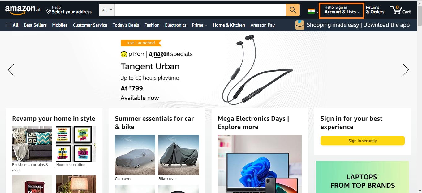
On clicking on the orange-colored box in the above picture, you will be directed to the following login-page
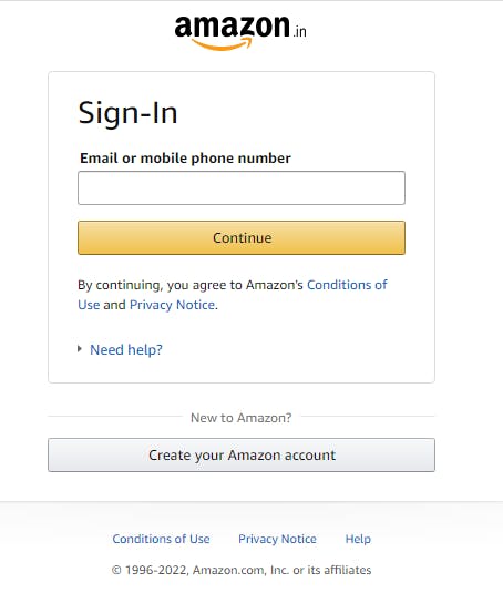 .
.
So, there's clarity in the above process with little distraction for the user.
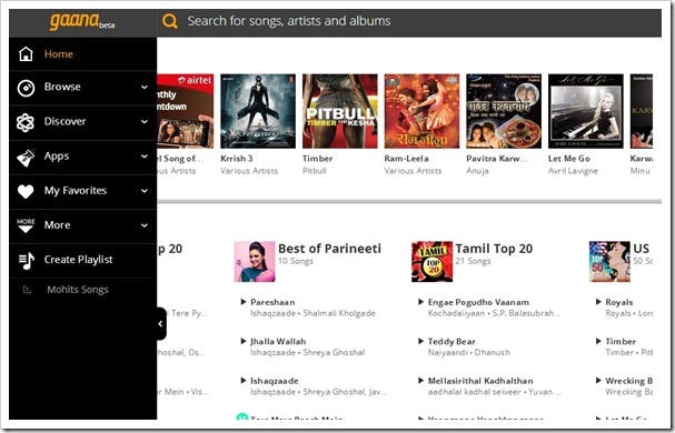
2.Confirmation
Let's take the example of another website which is gaana.com. When you add any song to the playlist, it shows a confirmation message stating that the song has been successfully added to the playlist. This is a standard way used in most of the song websites.
3. Consistency
It refers to the similar design pattern followed for each and every pattern so as to maintain consistency in the design.
Let's go to the example of amazon.in
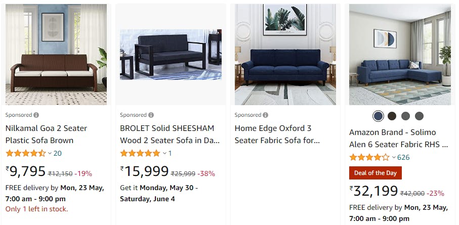 Suppose I'm interested to purchase sofa. For that I've typed sofa in the search bar and it takes me to the above result.
In the above picture, you can see that there is a uniformity in the design pattern is maintained. You can find 4 items per row and the hierarchy of descriptions ( such as title, rating, cost, delivery time, etc.) is maintained for all items. The font used is same for all items. Such consistency is maintained across different platforms such as mobile apps [android or ios] etc. In different devices
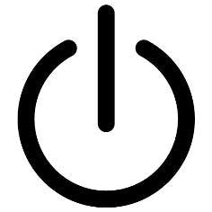
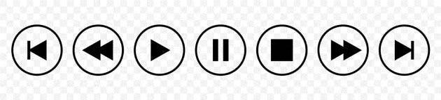
4. Familiarity
You must have been familiar with the following power button. It will take no time for an user to interpret the power button represented in various forms.
The same is the case with play buttons which you have encountered uncountable times in different designs.
Have you ever wondered why recycle bin in windows resembles with a real-life-dustbin?
5. Comprehensibility
The messages given in the pop-up dialoges should be clear and unambiguous so as to be understood by the users.
6.Navigation
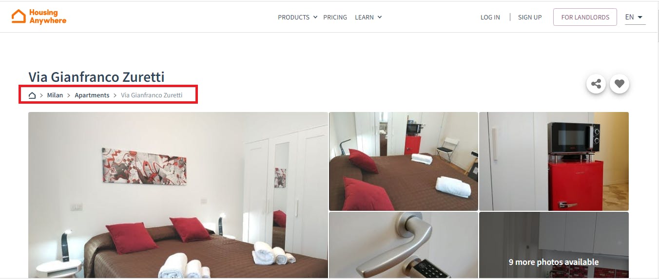
Breadcrumbs [as shown in the red-colored box picture in the following ] help in the navigation of the web pages. Different categories are linked through a pathway, assisting the users to navigate smoothly through their desired location on a website. It can be treated as a directory.
Conclusion
Any good design involves a lot of iterations in the view to achieve the best design as per the demands of the users. For that, the UI/UX designer needs a lot of ideas and supportive collaborations. More the collaborations, better will be the results.
P.S : I'm participating in the The Epic Hashnode Writeathon , #TheHashnodeWriteathon ,under the category of WebApps #THW Web Apps .